It is an idea which is not new but we haven’t seen it too often implemented in the mobile apps.
How do you assist a user in discovering all the features of your application ?
We didn’t envision this problem when designing our apps (to be honest!). The majority of the software companies are creating videos and posting articles on their web site (if there are any !) and that is most of all. Cramming features in the app, and without training the user somehow to use them is a major deservice you can do to your app. Plus the usual “maladroite” user who can barely knows the way on handling normally a smart phone, the effect compounds.
For our complex applications there is a logic which stays behind and is borrowed from web sites:
- there is a database to store events, data, notifications, etc…
- there are sensors collecting data and adding significant metadata
- for each slice of data the user has control how to analyze it using reports and charts
- there is synchronization component between apps and our back-end (www.fleetgateway.com)
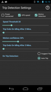
In order to make the most of our applications the user needs to spend time understanding the logic and how data is generated and presented (or parts of it). The options are somehow hidden in different screens and the terms might be confusing (ex: what is motion confidence percentage ?).
Solution ? Contextual help via toolbar buttons !
Each screen with more than 6-8 pieces of information has associated a help button – a circle surrounding a circle map in the right up corner (see image below).
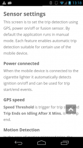
If the user has any questions regarding the usage of the screen or the meaning of the data, pressing the <help> button will open the page on this web site with detailed information about it.


